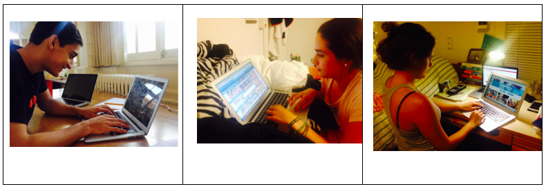
Once we had our pages ready, we obtained feedback from five representative users and decided to make some changes accordingly. The most relevant feedback is as follows:
Results
Landing Page:
- All users mentioned liking the "feel" of the page.
- All users found it clear/easy to use the dropdown menus to search for the required class.
- Most users mentioned that the page was "cluttered", with 2 of them specifically mentioning the pictures as a source of confusion.
Teach Page:
- Some users loved the background while others found it cluttered
- The appearance of text in the boxes was important, but they should both be of the same type (i.e: placeholder or beginning text)
- Users wanted more guidance as to what was optional and what wasn't
- Users wanted to be able to see the picture they were uploading
- Users wanted a feel of other classes being taught
Learn Page:
- Users do not understand at first why the images are so faded
- Users often didn't scroll down to see everything that was available to them, often because they didn't realize that they had to scroll down
- Users had no idea about how timing worked out, or that these were designed to be one-on-one classes
Reflections
As a result of the user feedback, we realized that although our design and visuals seemed to resonate with users, there were certain elements that caused confusion, and certain core aspects of our idea that didn't transmit completely to users.
These were the main reflections that we chose to carry over into our redesigns:
Landing Page:
- Remove the bottom pictures so as to reduce the clutter and eliminate user confusion.
- Alter the tagline to something more specific to and reflective of our mission.
Teach Page:
- Remove the cluttered background
- Add similar or inspiring classes to give a sense of what's happening in the user-selected space
- Make all text placeholder text
- Put red asterisks to indicate near an instruction to indicate what is compulsory
- Add an image viewing functionality to the image upload tool (depending on time)
Learn Page:
- Reduce the fading of the images
- Make everything fit on one page so users do not have to scroll
- Make explicit, either on this page or somewhere else on the site, that these are supposed to be one-time, one-on-one classes.
Here are 3 of the 5 representative users:
