View the Updated Version
of the Medium Fidelity
Prototype

Receive updates about resources and the environment (simple)
Map has broader functionality, showing drought + waterways + other relevant environmental info No login required, but if logged in through social media, now feed includes updates from contacts
Tracking user's own resource usage (medium)
3 resources' info now entered separately instead of on a single screen More emphasis on visual elements, e.g. graphs, figures
Taking steps towards personal usage reduction (complex)
Political actions replaced by personal consumption actions Planned continuous updates with new tasks
Explore the Prototype
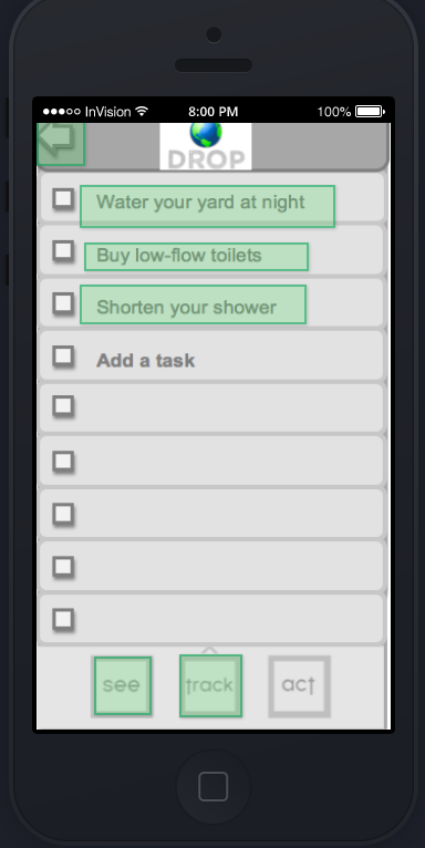
We added a navigation bar across the bottom of almost all screens, which frees users from navigating the tasks sequentially. Feedback indicated that the need to access the app in a particular order was frustrating. In general, this makes the app less confusing to navigate and will allow users to interact with only the parts of the app that they want to visit in a particular session.
The login procedure now allows a user to access some features without creating an account, to rely on existing social media accounts, or to use their phone's GPS to locate them. These options make it easier for users to login quickly and to tailor their experience to their particular needs. By offering a login with Facebook/Google option, we also are able to integrate social media functions by providing a user information about their friends who also use Drop.
Finally, we moved the map from its own screen to serve as an anchor for the newsfeed feature; it sits at the top of the newsfeed and allows users to have a frame of reference before seeing updates. We made this change because the map previously was low-functionality and not particularly engaging, but served as a landing page. To fix this, we made it less of a standalone feature and connected it to other functions more directly.

We used Invision to link screens together, and created the screens using Word and Photoshop. Invision allowed us to create button actions anywhere on our screen designs. It also let us change the parts of the screen but maintain links between screens, by uploading a similar image with the modifications we needed. This was convenient, as it allowed us to make changes throughout the week without having to relink all of the screens.
Invision did cause some complications, such as a lack of scrolling and no support for standard interface buttons. It serves as an effective simulation, but eliminates the personalization that will ultimately give Drop its power. See the next section for more detail on the limitations inherent in this prototype.
This version of the application only focuses on water, which we chose to do so that we could create a more comprehensive experience for the limited part of the app we chose to construct. We chose to focus on a limited subset of the total screens and links we would need for all three so that each that we did include could be more detailed and considered.
Similarly, we chose not to create functional newsfeed and login screens. This allowed us to focus on layout, connections and flow, and content, over creating underlying wiring that will take a lot of time for limited tradeoffs. Ultimately there will be many external dependencies, with the app pulling in content based on a user's location, social networks, and previous actions (that is, their resource use trends and resource reduction actions they have taken). Eventually, we also hope to have the navigation bar at the bottom change color to indicate which of the three sections a user is currently in (see, track, or act).
This prototype did not involve any Wizard of Oz techniques to function, but as noted above we made extensive use of hard-coded data, including login information, resource use data, and location settings.