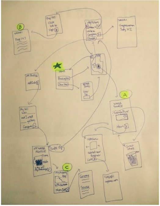
In Figure 1, the full flow of the app in a single drawing can be seen. These screen representations are even lower-fidelity than the sketches we used in the actual user testing, but it is a useful abstraction to see how the tasks relate to each other and the central hub of the application.
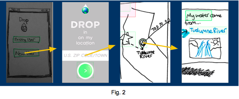
The first task we tested is illustrate in Figure 2. It is fairly simple: a user enters their location, the application finds their resource sources, and then the results are displayed intuitively on a map. They can then click on each source for more information.
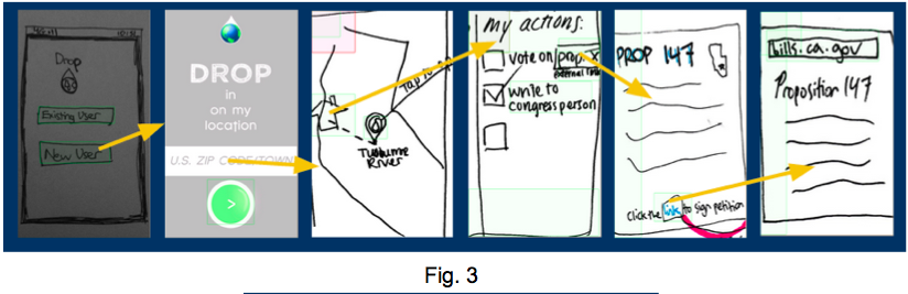
Figure 3 shows the second task, which allows users to learn more about how they can be active in political or other areas after having learned about and considered their resource usage and sources. The general actions checklist is pictured in the center, and more detailed information about a particular policy initiative acts as an example of how action items might appear.
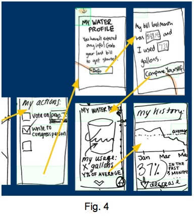
Figure 4 illustrates the flow for our final task, in which users can enter and compare their own resource usage to aggregate metrics, like regional or demographic averages. As we have it designed for the low-fi prototype, after looking up their location and considering general actions they could take, a user can move from the overall actions screen to an individual profile for the given resource (in this case, water). There they will be prompted to enter more information, and then can view the results in various formats.
Subjects: Our participants were a mix of people, some of which we knew had already taken CS 147 and therefore had a baseline understanding of what our team hoped to get out of the user testing process (e.g. a look at the app from a usability perspective, detailed user feedback, etc.). All of the testers are familiar with mobile apps and had a basic understanding of how such a tool would function.
Environment: Testing took place in the locations that were the most comfortable or convenient for the test subject, which simulated regular use patterns in their natural environs. This included their own dorm, the dining hall, and other public and private spaces.
Tasks: The users were asked to open the app and navigate through it. The current way the app is set up naturally takes the user through each task, starting with learning information and moving through political activism and personal data comparison.
Procedure: After the introductory portion of the script, we allowed the participants to work their way through the app without guidance. The only exception is when one of the participants got stuck in a loop due to a lining error in the preliminary prototype, where the experimenter explained what was supposed to have occurred and what options there should have been at that point in the app. Once a task had been completed, the simple instructions for the next task were given. At the end, we invited any uncategorized feedback on the part of the user.
Test Measures: General numerical ratings of events during interaction; time to complete each task

Several main findings emerged as a result of the interviews. The basic structure of the app was somewhat incomplete, as the connecting points we had established in the low-fi mockup made it possible for a user to get stuck in a loop where the only links off a screen led back to the same screen, or where it was prohibitively difficult to navigate to disparate sections of the app. This made use testing less informative than it might otherwise have been since it increased the chance a user would get confused or frustrated. The lesson here must be to ensure final versions make it easier and more obvious how to escape cycles among links in the app.
It also became apparent that even though navigation had been designed to be systematic and consistent (i.e. swiping in the same direction to navigate from one screen to the next), it was not obvious enough to the user how to begin without arrows or some other type of markers to delineate the actions available to them.
In this early prototype without working content, it became clear that the app depends heavily on visual stimulation in order to engage the user. In other words, the concept and/or function itself is not enough to maintain a steady interest level; it needs to look and feel cool. Because this version did not meet this stricture, it was rated more poorly than it might have been otherwise.
An additional opinion voiced by multiple users is that the personal analytics were more useful and relevant to them than the educational or political tasks. Their interest in the app was primarily consumer-centric. One of the users commented that the additional information presentation section was the easiest part of the app to navigate, but also the least unique or useful.
Based on the findings above, our team is reconsidering the flow of the app. Drop currently takes you through all three tasks back to back. However, since our testers were less interested in two of the three tasks and more interested in personal comparison, it would probably make sense to split the tasks up and give options at the beginning to select one and start there.
It is also clear that our team needs to rethink navigation and how to explain to the user how to swipe and tap their way through the app. One of the users did find the swipe-down action on the news page very intuitive, but in general did not like the layout of the app as a whole. She found it easy to get lost in the app and didn't know how to navigate back to previous screens if she wanted to access them again.