Statechart Design Patterns
"Design patterns are recurring solutions to software design problems you find again and again in real-world application development." (source)
This section of the user guide is a collection of design strategies that we have found useful for expressing commonly found interaction paradigms in the d.tools statechart language. They are not a complete reference of statechart patterns, but rather a selection of what we found most useful during our own prototyping with d.tools.
Patterns:
- Pattern 1: Transition from one state to another
- Pattern 2: Toggling between two states
- Pattern 3: Navigating a list with buttons
- Pattern 4: Navigating a list with a continuous input component
- Pattern 5: Reuse States
- Pattern 6: Using discrete controls within a state
- Pattern 7: Using continuous controls within a state
Pattern 1: Transition from one state to another
This is the most fundamental pattern of the d.tools visual language. A transition connects two states through input events. If the active state is the outgoing state (the one at the start of a transition arrow) and an input (from attached hardware) is received that matches the component and event of a transition, then the state at the end of the transition is turned into the new active state and it's content (images, sounds, LED behaviors) is sent to connected output components. You can edit the input component and the input event for a transition by selecting the transition arrow and viewing its properties in the Property view.
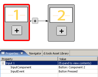
An Example: Let's assume we have a simple device that shows the number "1" on its LCD screen in one state. We now want to add behavior such that the screen should change to show the number "2" when a button is pressed. This can be achieved as follows:
Note that we chose "Button Pressed" as the Input Event. If we had selected "Button Released" instead, the transition would only happen once the user lets go of the button.
You can also author some behaviors by creating control connections within a state, as explained in Pattern 6
Pattern 2: Toggling between two states
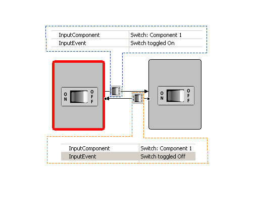
Toggling something on or off can be done with two states. We illustrate toggling below with a switch - you could also imagine two states connected through a button - with transitions from state 1 to state 2 on a Button Press and back from 2 to 1 on a Button Release... Note that toggling is the same as navigating through a list that only contains two items.
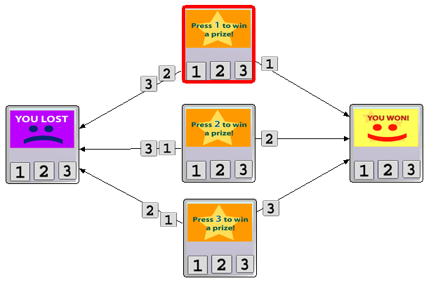
Pattern 3: Navigating a list with buttons
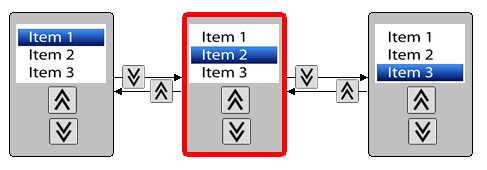
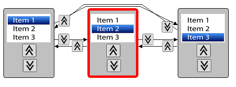
Scrolling through a graphical or textual list of items can be accomplished by creating separate states with separate images for highlighting each item in the list. Our example above uses an LCD screen and two buttons, one for scrolling up and one for scrolling down. In each state, pressing the up button goes to the state holding the image that moves the highlight bar to the previous item in the list, pressing the down button moves the highlight bar down. But what happens when the user is in the rightmost state and presses the down button? At the moment- nothing, since no outgoing transition is defined for the down button. We can add wrap-around, i.e., jumping from the Item 3 state to the Item 1 state and from 1 to 3:
The transition arrows will avoid passing through other states, but may occasionally cross each other. To select the right transition arrow, remember that the transition icon is closer to the state where the transition starts (the outgoing state).
Pattern 4: Navigating a list with a continuous input component
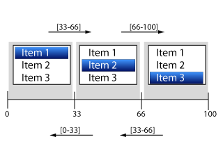
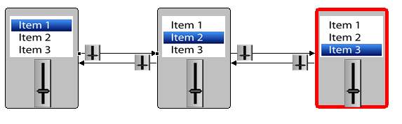
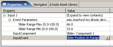
Using a continuous controller such as a button or a slider to navigate a list is a little trickier, but also possible. Remember that continuous controllers output values in the range from 0 to 100. For a list with three items, we can break the range 0 to 100 into three intervals: 0 to 33 (corresponding to item 1), 34 to 66 (corresponding to item 2), 67 to 100 (corresponding to item 3). We can now tell which slider values to use to get us from any one state to any other state: those that make up the interval of the target. Thus, if we are either in item 1 or in item 3 state, we create a transition for the slider component, select "Slider Position in Range" as the InputEvent, and give 34 to 66 as the minimum and maximum values of the range. The following diagram hopefully clarifies this solution:
Here is a sample solution from the statechart editor - showing the state diagram and the properties of the left-to-right pointing transition from the Item1 to the Item2 state:
Advanced Note: in the example above, we've implicitly assumed that our hardware slider return linear values -i.e., that it returns 33 when moved 1/3 of the way from min to max, 50 when moved half way, etc. You will find that most sensors don't respond that nicely and you may have to experiment until you find good interval ranges for your particular input component.
Whenever you find yourself with two states in your statechart that represent the same point in your interaction model, you can eliminate one of them and redirect all of its transitions to the other copy to converse screen space in your diagram. Each state can have multiple outgoing and multiple incoming transitions. You can also have multiple outgoing transitions that lead to the same target state. Here is an example of a redundant statechart, which we will then simplify:
Here is the simplified version, with merged states:
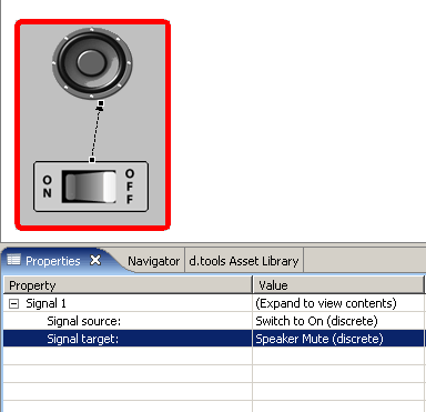
Pattern 6: Using Discrete Controls Within States
Connecting an input component to an output component within a state creates a control connection, indicated by an arrow with a dotted line.Controls allow authoring of simple behaviors without having to create new states. Input components act as control sources and output components offer control targets. Once you have created a control connection arrow, you can pick which source of the input component you want to connect to which target of the output component through the Property view. In the example below, we have connected the "Switch to On" source of a switch to the "Speaker Mute" target of a speaker. Now, whenever the switch is toggled to the "On" position, the Boolean value "True" is sent through the control connection, causing the speaker to be muted. When the switch is toggled "Off", "Switch to On" becomes false and the speaker is unmuted.
Combining control connections with state transitions allows you to author parallel behaviors that are independent of each other within a single statechart. To learn about available control sources and targets, consult the page on input and output components in this guide.
Pattern 7: Using Continuous Controls Within States
While discrete control sources only send true or false to their targets, continuous control sources can send a value between 0 and 100. Components with continuous targets can receive this value and use it to set their internal state. For example, you could control the volume of a speaker, the position of a servo motor, or the brightness of an LED with a slider. Draw a control connection arrow from your continuous input component to an output that can accept a continuous control signal, then specify signal source and target through the property view as described in pattern 6 above.
To learn about available control sources and targets, consult the page on input and output components in this guide.