 Bringing Design
to Software
© Addison-Wesley, 1996
Profile 2. The Alto and
the Star
Profile Author: Terry Winograd
In 1970, the Xerox Corporation established
the Palo Alto Research Center (PARC), to invent the future of
the electronic office. In PARC's first decade, a stream of innovations
emerged that set the stage for today's computer industry. Among
other technologies, laser printing, local-area networking, and
desktop publishing software were first developed at PARC. Many
of the prominent companies in the computing industry, such as
3COM, Adobe, and Apple Computer were started or were heavily
influenced by PARC graduates.
PARC's most notable innovation was the personal computer,
which grew out of earlier concepts by Alan Kay for what he called
a reactive engine and a Dynabook . The progenitor
of the modern personal computer, the Alto, was developed in 1972
by Kay's Learning Research Group (LRG) and a number of researchers
in PARC's Computer Systems Laboratory (CSL), under the direction
of Robert Taylor. Just as the Model-T contained the fundamental
elements of a modern automobile, the Alto included the central
elements of today's personal computer: a bitmapped graphic display,
which enabled it to display text in multiple fonts, combined
with graphics; a mouse as a pointing device; removable magnetic
storage; and an operating system designed for a single user who
alternates among multiple applications. Although the Alto's cost
at the time was high (at standard industry markup, it would have
sold for more than $75,000), the PARC strategy was to act as
though the Alto was a personal computer—to put one on every
desk and to see what people would do with it.
The result of this bold strategy was a proliferation of experimental
software for writing, drawing, communicating, teaching, and computing
in many domains. The Smalltalk language and programming environment,
developed by Kay's LRG, pioneered uses of the graphic interface.
Other software developed in CSL included the Bravo text editor,
which developed many of the sophisticated features of today's
word processors and was the predecessor of Microsoft Word; Draw
and Markup, the ancestors of MacDraw and MacPaint, and the many
drawing programs that later followed their lead; and programs
that made it possible for personal-computer users to make use
of networked facilities for file storage and laser printing.
The Xerox Star was born out of PARC's creative ferment, designing
an integrated system that would bring PARC's new hardware and
software ideas into a commercially viable product for use in
office environments. The Star drew on the ideas that had been
developed, and went further in integrating them and in designing
for a class of users who were far less technically knowledgeable
than the engineers who had been both the creators and the prime
users of many PARC systems (one of PARC's favorite mottoes was
"Build what you use, use what you build.") As David
Liddle describes in Chapter 2, the Star designers were challenged
to make the personal computer usable for a community that did
not have previous computer experience.
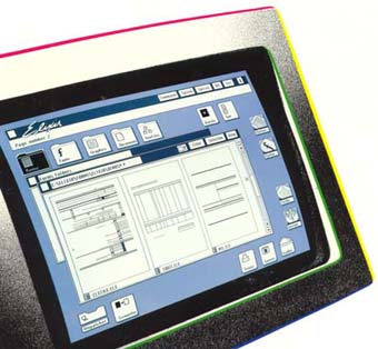
From today's perspective, the Star screen (Figure 2.4) looks
rather unremarkable, and perhaps a bit clumsy in its graphic
design—a boxy model-T when compared to the highly styled
look of today's Taurus or Jaguar. What is notable from a historical
perspective, of course, is how much the Star does look like current
screens and how little it looks like the character-based and
vector-drawing screens that preceded it.

Figure 2.3 [in the book, not the exact one here] The
Star (Viewpoint) screen image The Star pioneered the
now-familiar constellation of icons, moveable scrollable windows,
and intermixed text and graphic images. The widely used graphic
user interfaces (GUIs) of today are all variants of this original
design. (Source: Reprinted by permission from Jeff Johnson et
al. Xerox Star, a retrospective. IEEE Computer 22:9 (September,
1989), p. 13.)
The visible mechanisms on the Star display were backed up
with a set of design principles that grew out of a user-oriented
design methodology and by a great deal of empirical testing,
as described by Liddle in Chapter 2. Several principles were
central to the Star design:
1. Direct manipulation. The core concept that distinguished
Star (and other Alto programs) from the conventional computer
interfaces of their time was the use of a bitmapped screen to
present the user with direct visual representations of objects.
In the Star'sdesktop metaphor, documents, printers, folders,
collections of folders (file drawers and cabinets), in and out
boxes, and other familiar office objects were depicted on the
screen. To print a document, for example, the user could point
(using the mouse) to the icon for the document and the icon for
the printer, while using a key on the keyboard to indicate a
Copy operation.
2.WYSIWYG (what you see is what you get). In previously
available programs for producing sophisticated graphical output—such
as drawings or page layout with multiple fonts—the user
created and edited a representation that looked like a programming
language, and then compiled the resulting program into a visible
form. Alto programs pioneered a new style that Star unified,
in which the user works directly with the desired form, through
direct manipulation. The user makes changes by operating on a
direct representation of what will appear on the printed page.
As shown in Figure 2.3, the Star user could intermix text, tables,
graphs, drawings, and mathematical formulas. In fact, most of
the popular microcomputer applications of today have not yet
reached the degree of integration that Star offered more than
a decade ago.
3. Consistency of commands. Because all Star applications
were developed in a unified way by a single development group,
it was possible to adhere to a coherent and consistent design
language (see Chapter 4 for a discussion of design languages).
The Star keyboard embodied a set of generic commands, which
were used in a consistent way across all applications: Move,
Copy, Delete, Open, Show Properties, and Same (copy
properties). Evoking one of these commands produced the same
behavior whether the object being moved or copied, for example,
was a word of text, a drawing element, or a folder of documents.
Through the use of property sheets (Figure 2.1), the user could
manipulate the aspects that were specific to each element, such
as the font of a text character, or the brush width of a painted
line. The Open command was the basis for applying a technique
of progressive disclosure—showing the user only the
relevant information for a task at hand, and then providing a
way to reveal more possibilities as they were needed.
In addition to these three key concepts, many specific design
features made the Star unique, including its attention to the
communicative aspects of graphic design, its integration of an
end-user scripting language (CUSP), and its underlying mechanisms
for internationalization—from the very beginning, Star versions
were developed in several languages, including non-European languages
with large character sets, non–left-to-right orthography,
and so on.
Some of the aspects that led to the Star's design quality
may have also hampered its commercial success—in particular
Xerox's dependence on development groups within a single company
to produce all the applications software. But the result was
one that supports Liddle's assertion that "In some aspects,
I still think that Star was a great advance over its successors."
Suggested Readings
David Canfield Smith, Charles Irby, Ralph Kimball, Bill Verplank,
Eric Harlslem. Designing the STAR user interface.Byte
7:4 (April, 1982), 242–282.
William Bewley, Teresa Roberts, David Schroit, and William
Verplank. Human factors testing in the design of Xerox’s
8010 "Star" office workstation. Proceedings of CHI'83,
New York: ACM, 1983, 72–77.
David Liddle, Design of the Conceptual
Model, in Bringing Design to Software, Addison-Wesley,
1996, 17-31.
Additional Source Materials (not in BDS as published)
Bruce Damer's Personal Histories of the Desktop User Interface:
A Retrospective of the Xerox Alto, Star 8010 System and Elixir
Desktop: http://www.damer.com/pictures/elixir/products/star.html
Lawrence Miller and Jeff Johnson, The Xerox Star: An Influential
User Interface Design, in Rudsill, Lewis, Polson, and. McKay,
(eds.) Human-computer Interface Design: Success Stories, Emerging
Methods, and Real-world Context.(1996). 70-100.
Bill Verplank, Graphic challenges in designing object-oriented
user interfaces, in Martin Helander (ed.), Handbook of Human-Computer
Interaction, Elsevier, 1988 (First edition), 365-376.
Video: Xerox Star Interface: An Overview [Xerox], SIGGRAPH
Video Review Issue 56 - CHI '90 Techincal Video Program
Video: The Final Demonstration of the Xerox 'Star' Computer,
1981. Xerox PARC, June 17, 1998 (2 tapes, TRT 1:59:00 + 21:30).
 Bringing Design
to Software